Proud to Present: a beautifully rural brand for While We Wander
Jo Stay is so ridiculously aligned with the countryside that I’m not sure I’ve ever met anyone more in tune with rural life. Which is saying something - I know a LOT of farmers!
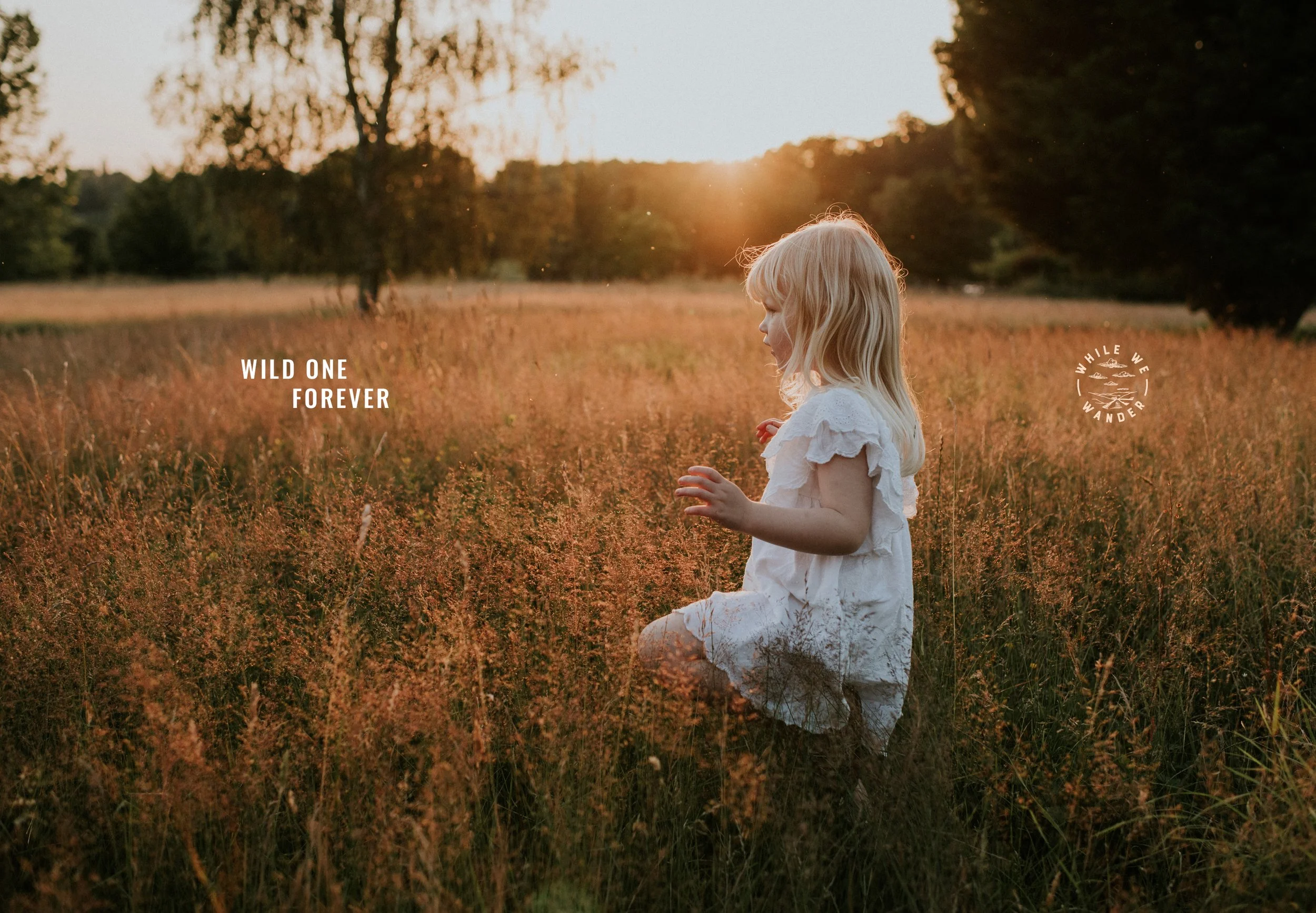
A rural soul and talented photographer, Jo has a natural eye for gorgeous light and a rare talent for capturing real lives in a way that’s at once authentic and artistic. Since picking up her first ‘proper’ camera in 2014, she’s documented every moment of her young family’s lives. Her images tell tales of days getting muddy, sinking fingers into the soil, building dens with sticks and of windswept hair. It’s the honest recollection of life in the countryside with her children – of two wild little spirits turning less little as the days roll into months and years.
For seven years, Jo has photographed wonderful people at important moments in their lives. From the big milestone events such as weddings to the lesser celebrated, but no less important, moments of family life – all of these are moments which weave together to form the rich tapestry of life. Since starting her business, Jo has been devoted to telling the stories of people, places and lives that are forged and sustained in the countryside.
Jo approached us knowing that something needed to change with her business. With no discernible brand identity aside from a logo that no longer fitted the personality of her business, she was ready to up her game. Jo and I spoke at length during that first phonecall, discussing her feelings towards her business and her ambition for the future. It’s fair to say that her confidence was low and there was a tangible urgency for a jolt of something that’d help her to finally elevate.
I’m delighted with the brand we created for Jo. Early on, we discussed her brand name - Jo Ellen Pictures really didn’t cut it, and this was the first thing on my hit list! I knew the business needed something more evocative and meaningful - and so when Jo came up with While We Wander, i knew it was perfect. Conjuring up memories of hazy summertime walks in the countryside with not a care in the world, nothing could fit the brand better than this.
The new identity feels earthy yet artful, heaped with nostalgia and a warmth which reflects Jo’s signature creative style. Colours inspired by harvest season fit the brand perfectly, and a series of hand illustrated animals provide character and depth.
When we work with any creative, it’s so important to be mindful of their signature creative style. Anything at all that we create needs to be designed with that in mind, so that the resulting identity works harmoniously alongside their work rather than fighting for attention. We quickly noticed that Jo’s most standout work features rich, russet tones - she loves golden light and has a tendency to edit with warmth, so it was quite clear that the brand needed to emulate that.
Inspired by classic literature, typography has a sense of being long-established for a timelessness, and plenty of character is introduced through linocut illustrated pieces. Hares, pheasants and swallows are synonymous with the English countryside, and can beautifully embellish any page to provide a hint of the whimsy of hedgerows, meadows and walks in the woodland.
I’m so excited to see how Jo translates this new identity online and can’t wait to see where it takes her next!


