Proud to Present: A brand rooted in heritage for Crouch, the family butcher
The Crouch family have been such a joy to work with. We tend to work expecially well with family businesses; there's a unique dynamic to them which we entirely understand. Decisions can be more emotionally driven, and there's certainly another level of dedication which changes the flavour of the way they work. And Crouch butchers are certainly a brand that celebrates family. Started by Bill Crouch in 1977, the business has been built from the ground up by Bill and his wife Rowena, and has earnt a loyal and well established customer base across their three shops. Now headed up by Rob, a third generation master butcher, the business enjoys a thriving high street trade along with a busy wholesale arm.
They do what they do really well; they simply needed to express themselves better. Can you believe that they built thier business without a trace of an online presence?! As they prepare to refit their largest store (and to celebrate their fortieth birthday in style), the Crouch family approached Ditto for a brand that'd honour their heritage and put Crouch firmly on the map as the best, most desirable butcher in the South East!
The season personality
The seasons which best represent Crouch are Autumn and Summer. Autumn represents them best; Autumn personalities are strong, passionate, authentic and genuine. They are highly independent! Autumn characters are honest, fair and have a strong sense of integrity; they have a strong work ethic and taking care of friends and family is very important to them. Whatever they turn their hand to, they take great pride in their work and their life-long obsession with learning means they’ll never settle; they’re always on the hunt for the latest trend.
Summer personalities meanwhile are more reserved and thoughtful. They are refined, intuitive and stylish with an aspirational, luxury edge. Quality is high on the agenda for Summer personalities; they are structured and measured in their approach and won’t accept anything less than the very best that they can do. While Autumn is a bold season, Summer is quieter, reassuring and nurturing, instilling a sense of unassuming confidence that doesn’t need to be articulated to be felt.
The brand
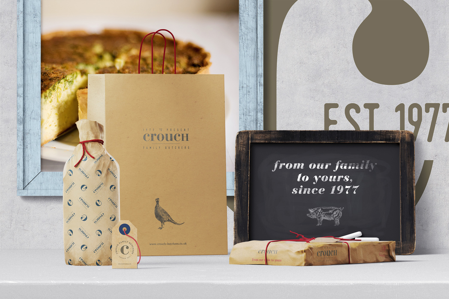
Fresh, clean and with a sense of space, there’s a feeling of warmth and elegance to the brand. It also feels wholesome; hand rendered illustrations, natural textures and kraft paper all lend a cosy, familiar mood which is approachable and engaging. This board balances the two seasons perfectly; while the typography feels refined and grown up, the quirkiness of the patterns, texture and illustrations create a hearty and wholesome feel.
Photography is raw and imperfect – exactly like family life. Typography is elegant yet grounded, with enough character to keep things interesting. The finishing flourishes, such as the bakers’ twine or unusual label shapes, add to the sense of everything being intentional, while reinforcing the overall mood.
This style is SO our jam. Derek created a gorgeous range of illustrations which absolutely stole the show during the brand presentation, and Dan's beautiful use of typography, colour, pattern and his signature photography styling really elevates this brand to something exceptional. There were tears all round when I presented this to the Crouch family. Rebranding a business can be incredibly emotive - and that's especially true for a family business where there's a heavier weight of responsibiliy on the younger generation to honour the business that their parents built from nothing. I'm so, so proud to have worked with this wonderful family and I absolutely can't wait to see the new brand rolled out. Check out their fancy pants new website here. Enjoy!


